
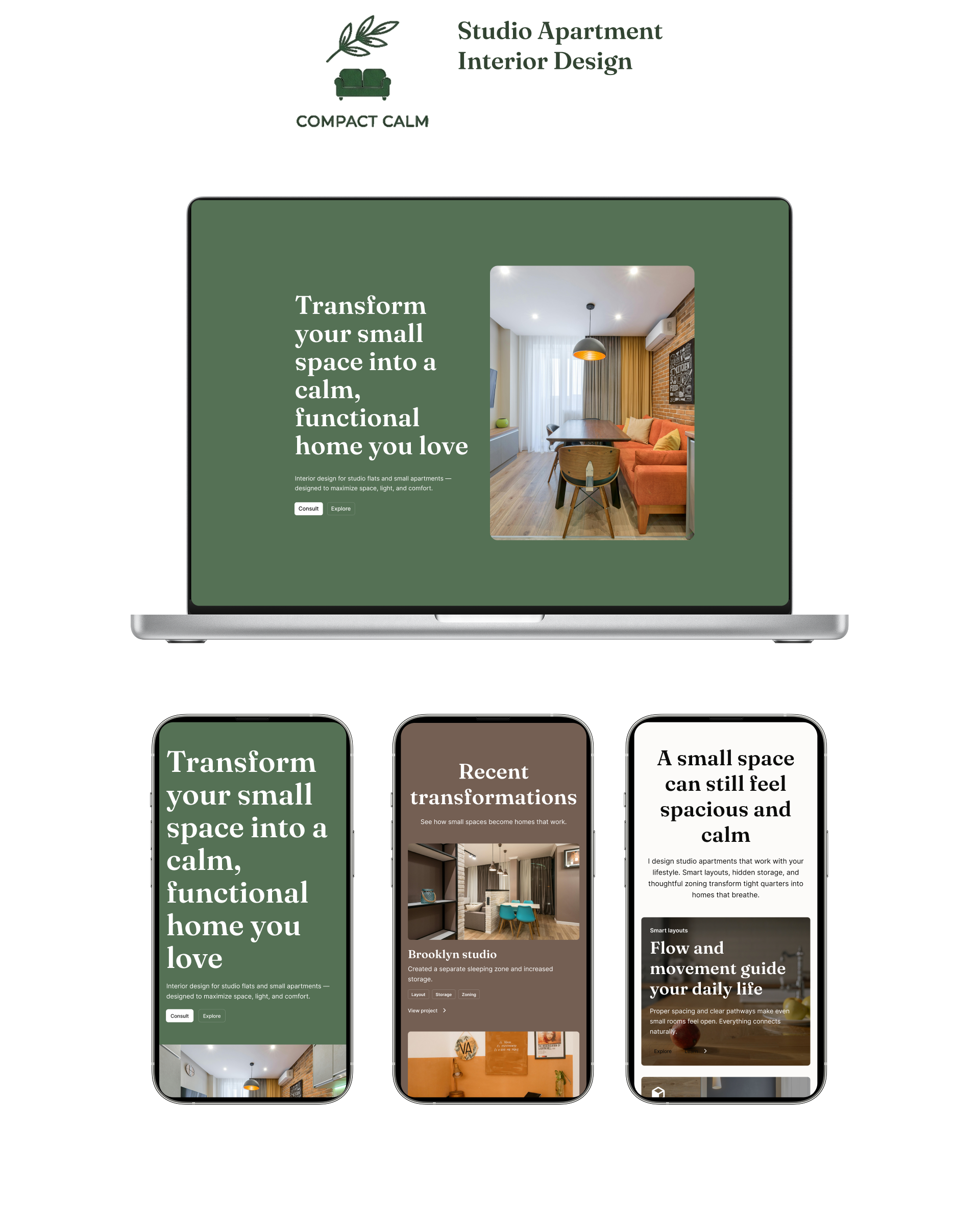
Designing a High-Converting Website for a Studio Apartment Interior Designer
This project focuses on designing a conversion-driven website for an interior designer specializing in small apartments and studio flats. The goal was to create a calm, structured experience that clearly communicates value and encourages potential clients to book a consultation.
project

Goals
- Create a clear and intuitive user journey.
- Position the brand as a practical solution for small-space living.
- Build emotional connection through relatable messaging.
- Introduce a transparent, step-by-step design process.
- Make calls-to-action more visible and actionable.
- Help users move from inspiration to confident action.
Challenge
Many interior design websites focus heavily on aesthetics but fail to guide users toward meaningful action. For people living in small spaces, the experience can feel overwhelming they struggle to visualize how to use their space effectively and are left without clear direction or confidence in the next step. Generic messaging, unclear user journeys, weak calls-to-action, and a lack of visible process reduce trust and make decision-making harder
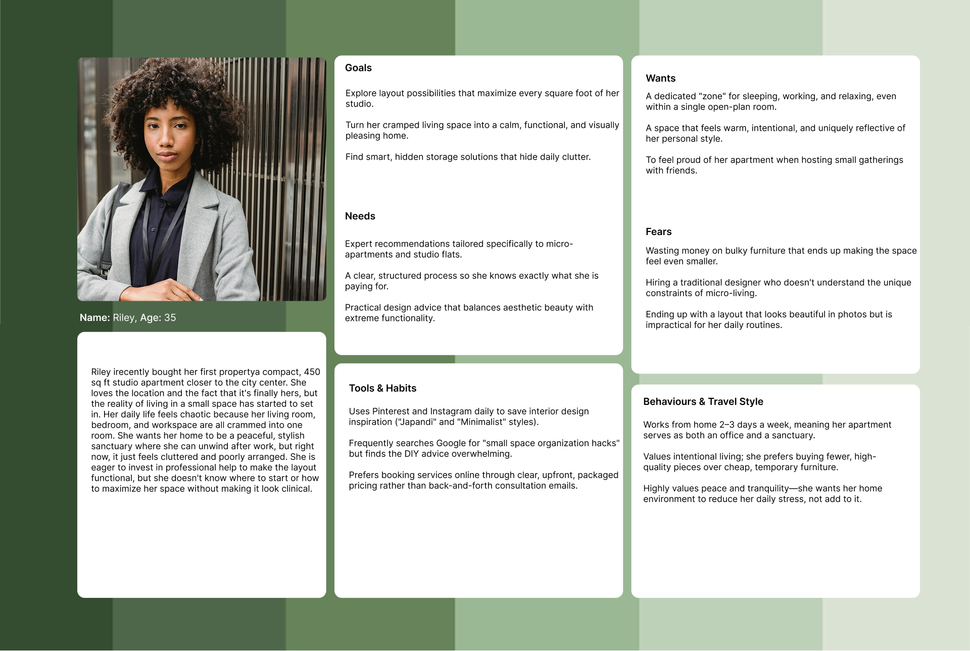
USER PERSONAS & JOURNEY MAPS
Target User
Young professionals and renters who live in compact spaces and want a home that feels calm, organised, and intentional.
Pain points:
- “My space feels cramped”
- “I don’t know how to organize it”
- “It doesn’t feel like home”
Desired outcome:
- Calm, functional, visually pleasing space
- Clear layout + smart storage
- Feeling proud of their home
Users want more than storage solutions — they want a space that feels emotionally comforting, functional, and visually balanced.
MY APPROACH
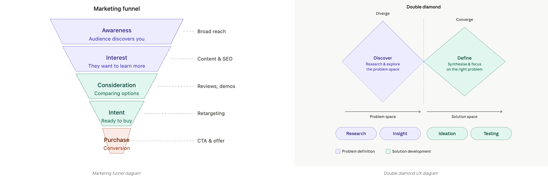
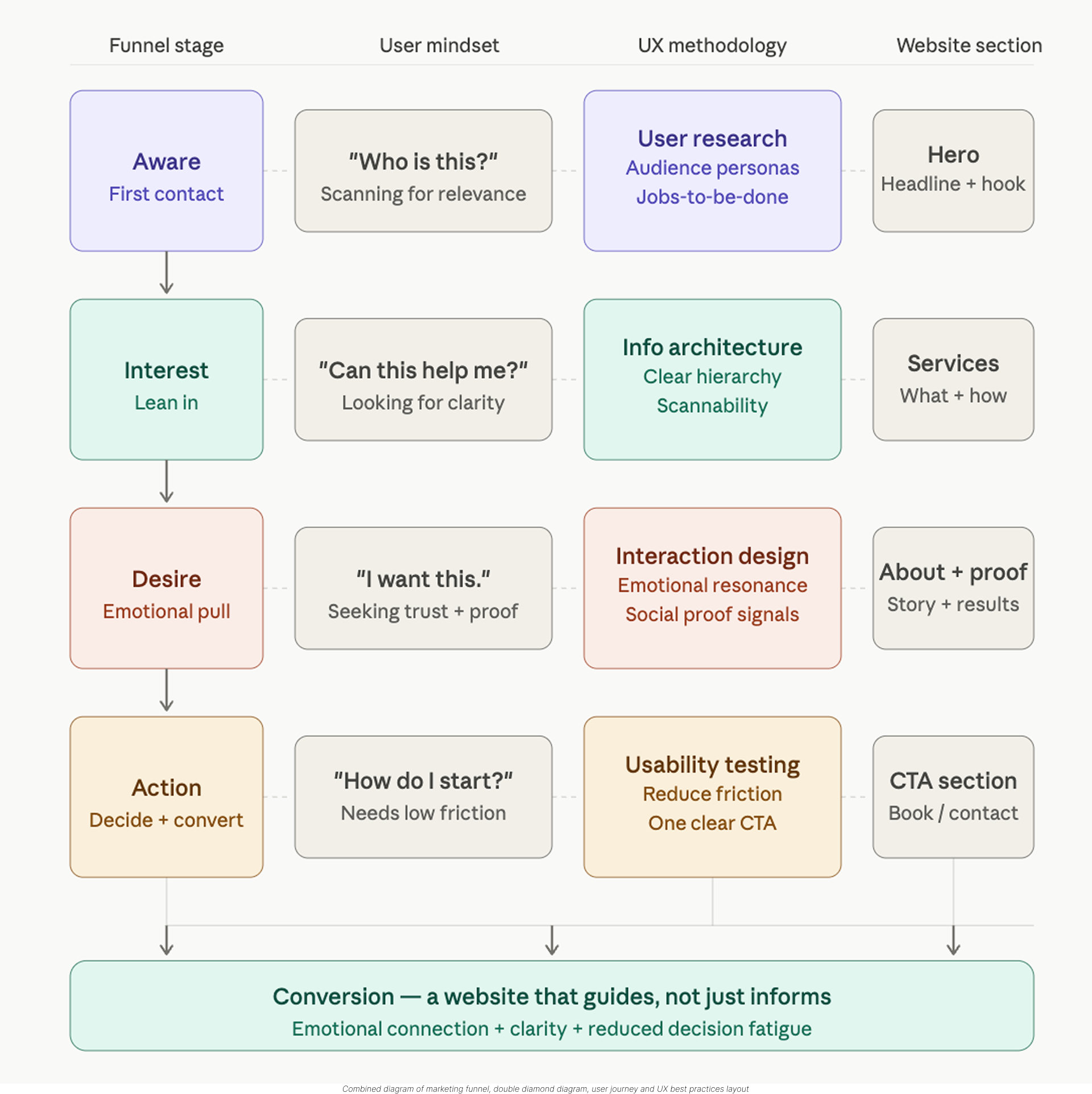
Instead of focusing only on visuals, I designed the website around a structured user journey aligned with a marketing funnel and UX metodolgy.
Strategy:
Guide users step-by-step toward conversionCombine emotional connection + clarityReduce decision fatigue
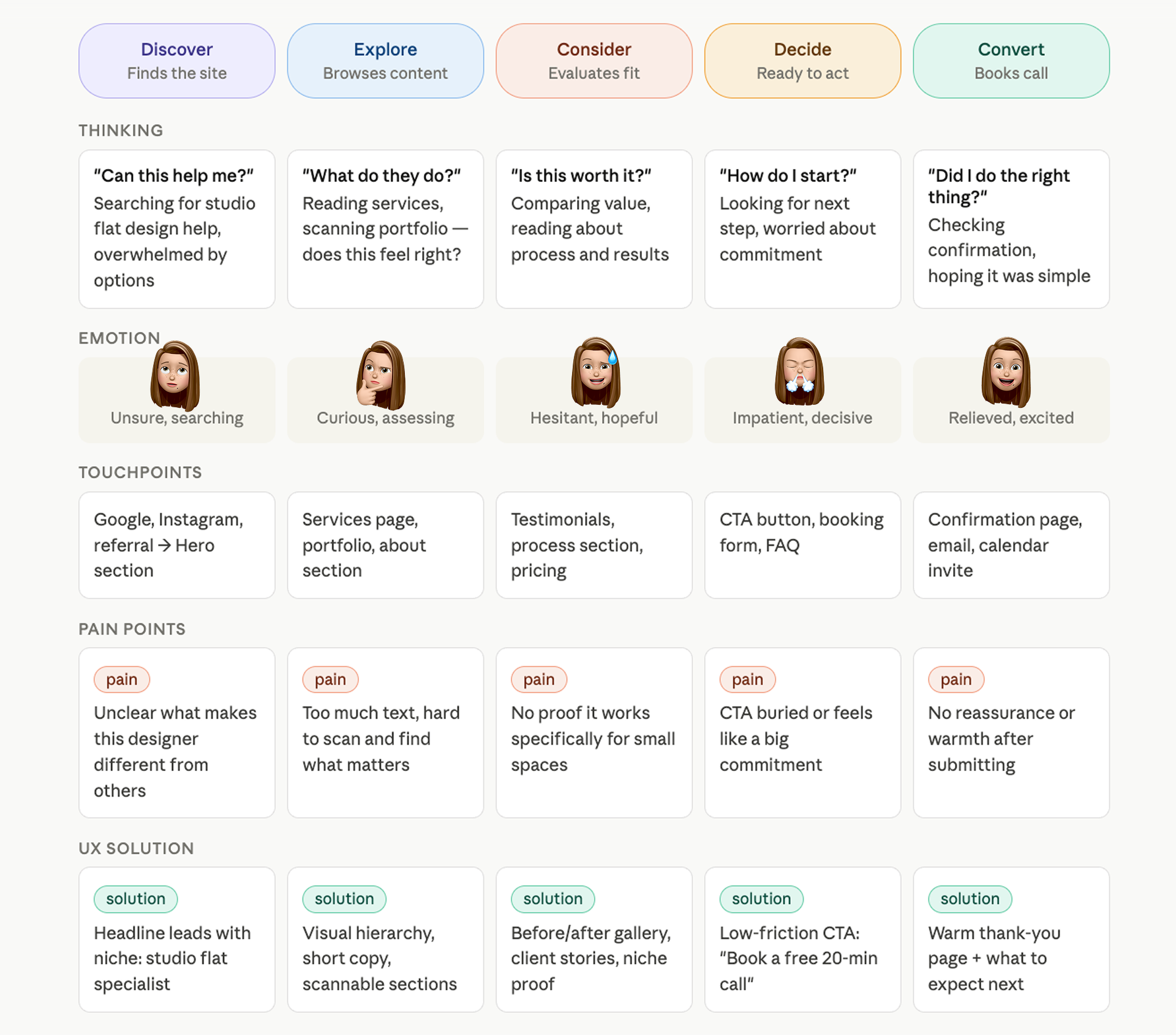
User Journey
This user journey strategically guides visitors from initial awareness by validating their space constraints, through consideration via transparent process sharing, and finally to conversion with clear service packaging.
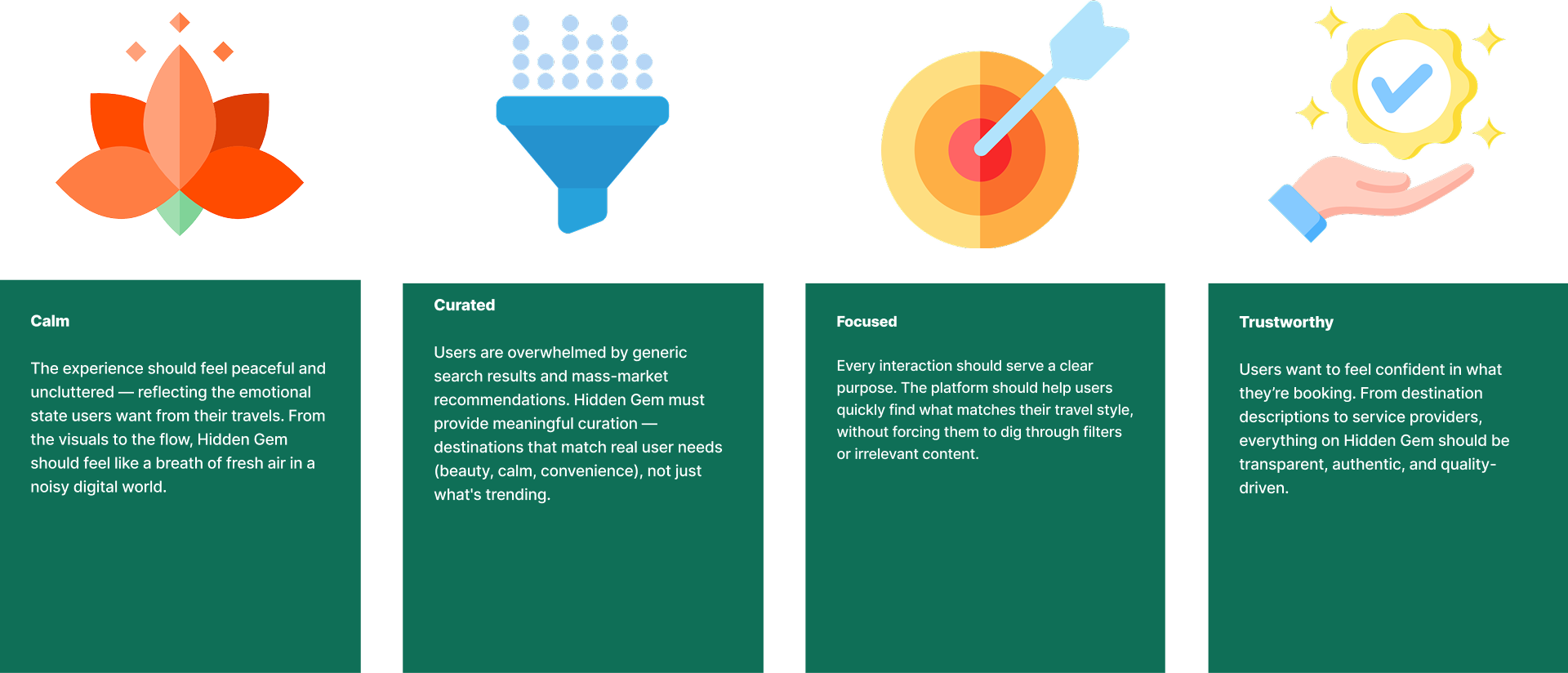
Design Principles
My research insights helped me determine that the solution should deliver the following key benefits for users.
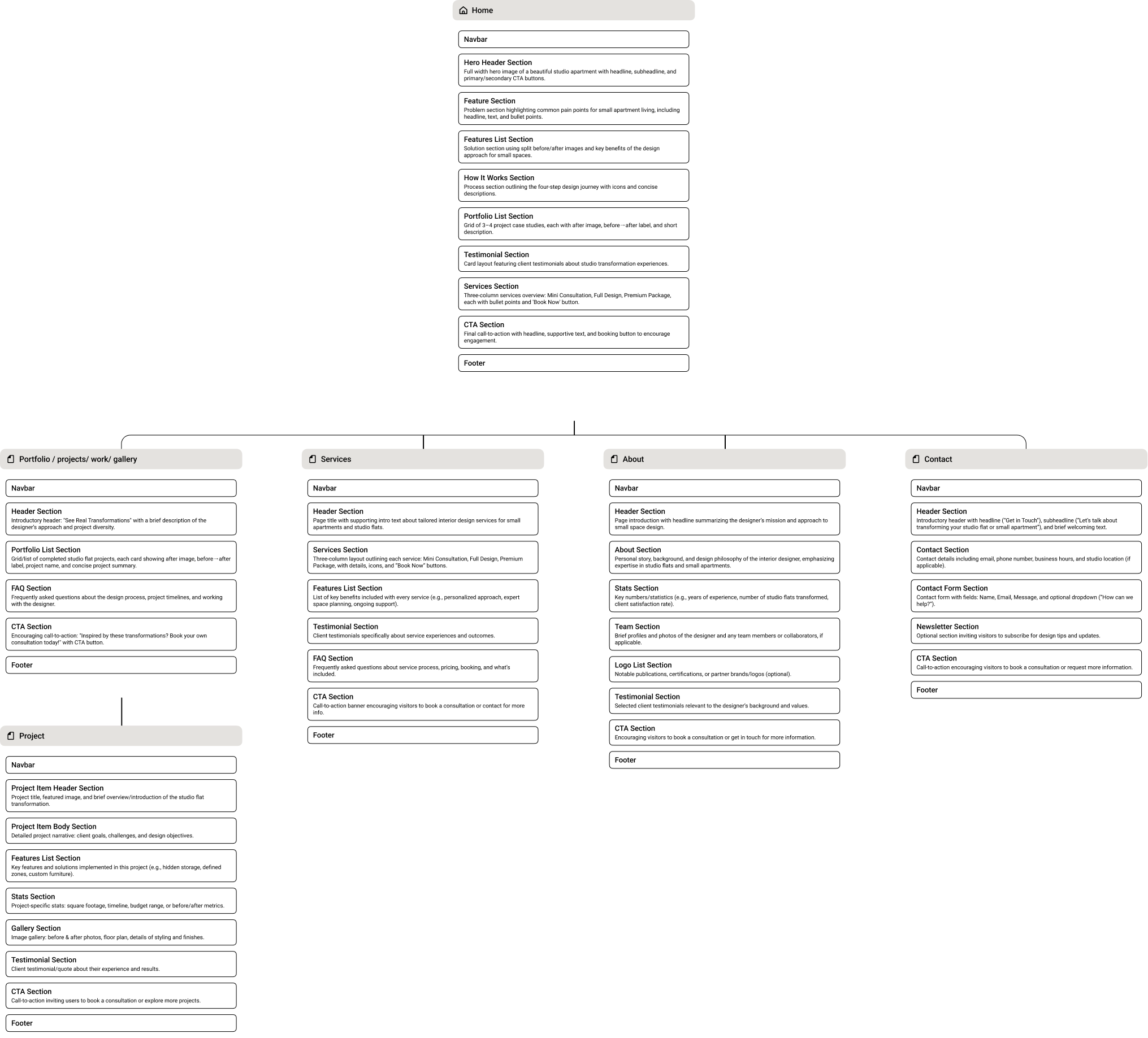
Information Architecture
Overview
To create a clearer and more action-oriented experience, I restructured the website around the needs of users living in small spaces. The information architecture was designed to reduce overwhelm, improve navigation clarity, and guide users naturally toward booking a consultation.
The structure prioritizes:
Clear user journeys
Simple navigation
Trust-building content
Strong calls-to-action
Easy access to services and portfolio work
The structure is designed to gradually move the user from confusion to confidence.
style guide
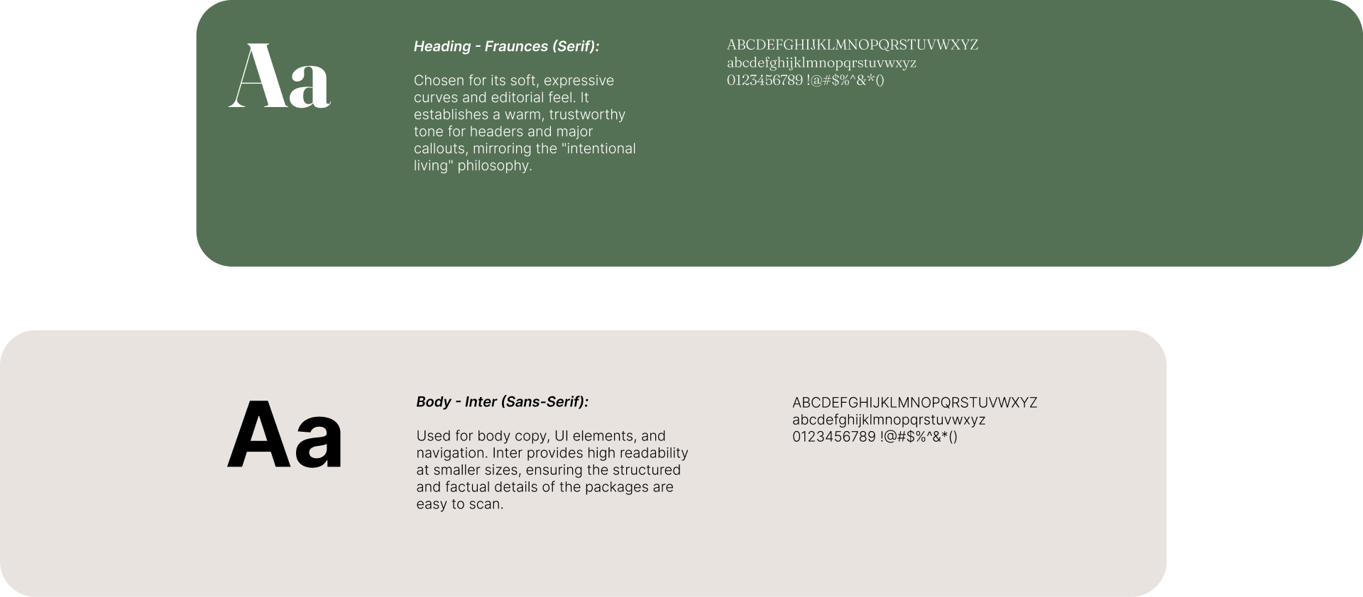
Typography
To create a balance between organic comfort and modern clarity, a editorial serif was paired with a highly legible geometric sans-serif.
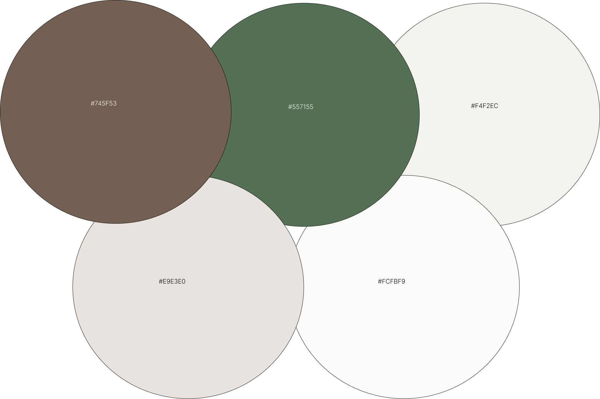
Colors
By balancing deep, nature-inspired tones with crisp, airy light neutrals, this palette creates a soothing and balanced environment that mirrors the philosophy of transforming cluttered spaces into calm homes.
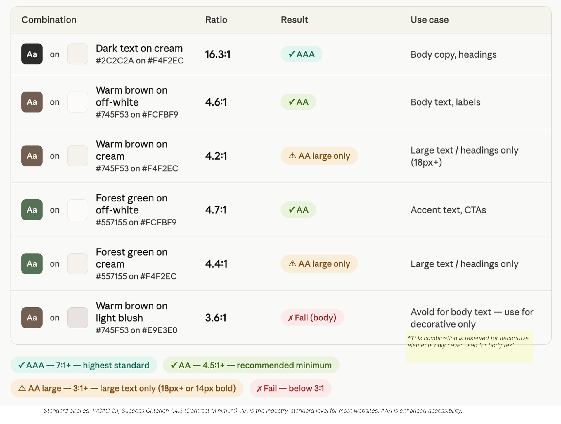
Colour contrast — WCAG 2.1
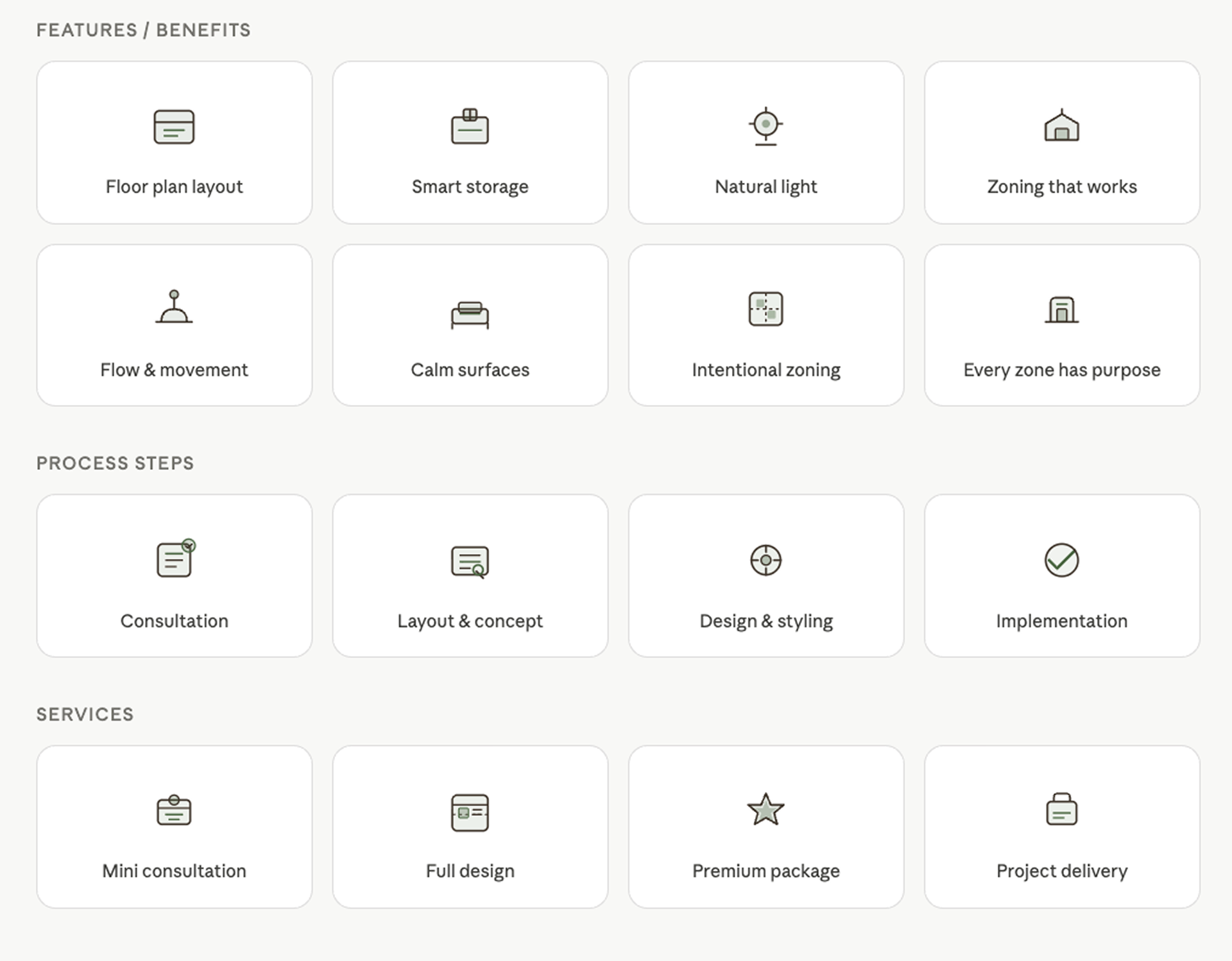
Icons
Low-Fidelity Wireframes
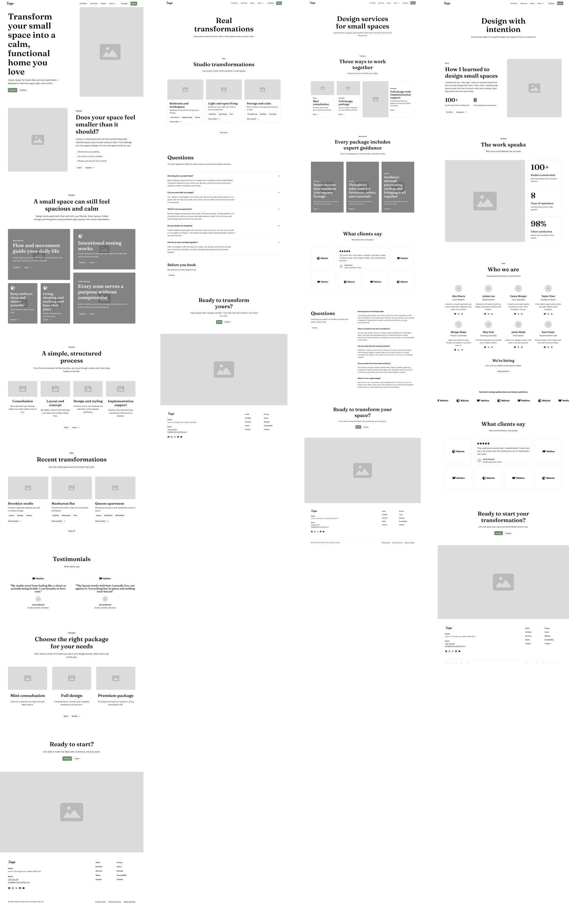
I wanted to visualize the user experience when interacting with the website. By creating wireframes, I was able to define the layout and structure without focusing too much on visual details. This approach helped me explore different ideas, solve layout challenges, and iterate quickly without getting caught up in the finer design elements too early.
prototype
High-Fidelity Wireframes
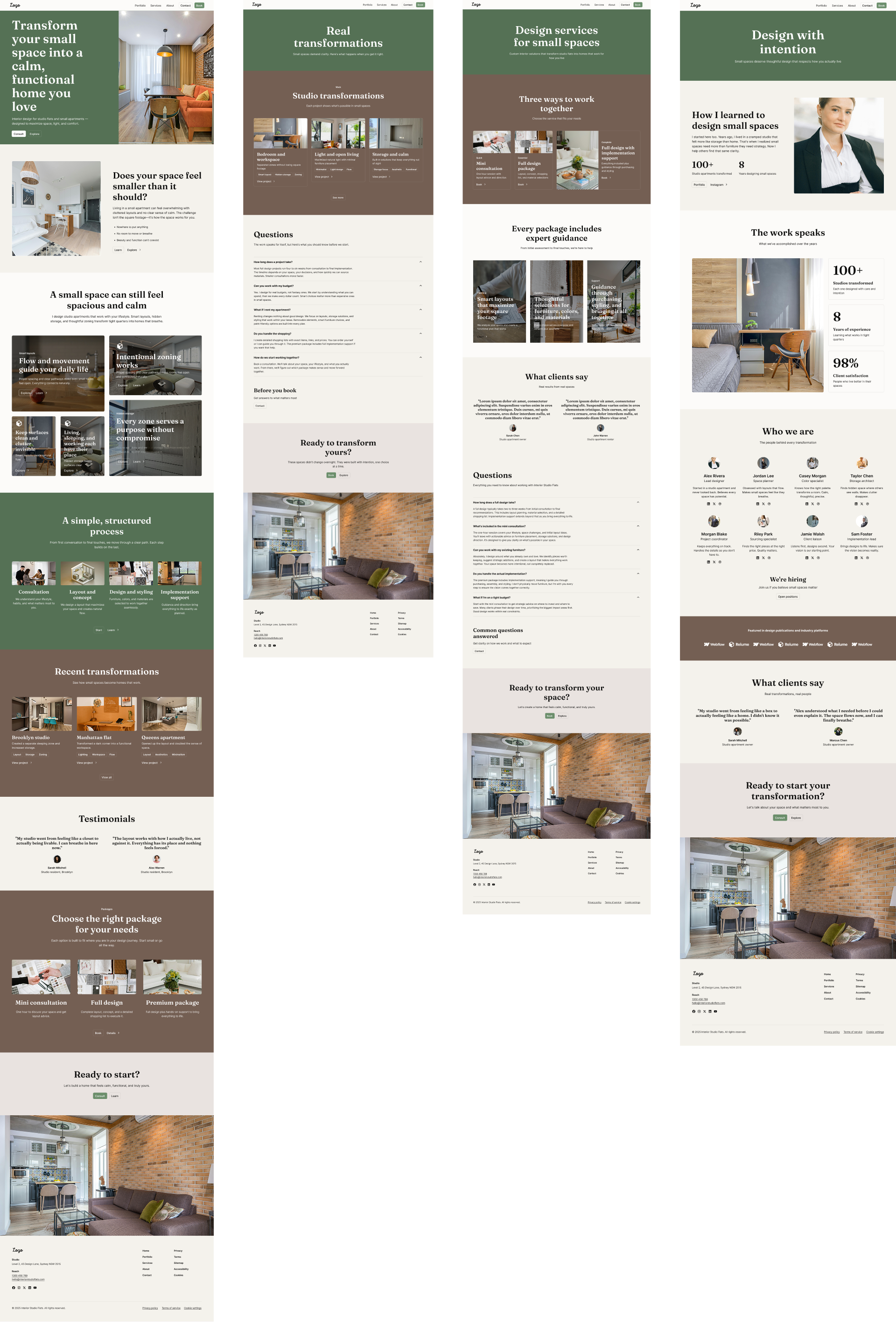
I developed and iterated on high-fidelity screens, bringing the visual identity to life by applying the color palette, incorporating the logo, and adding graphic elements to enhance the card visuals. These refinements helped create a cohesive and engaging interface that aligned with the brand’s personality while improving overall usability and visual appeal.
results
Outcome
The final design creates a clear and structured user journey, reduces friction, and aligns the visual identity with the target audience’s expectations.
Expected results:
- Increased clarity → better engagement
- Stronger emotional connection → higher trust
- Clear CTAs → improved conversion
Reflection
This project reinforced the importance of combining emotional storytelling with structured UX. Designing for small spaces is not only about aesthetics, but about solving real functional problems and making users feel understood.My focus was not just on how the website looks, but on how it guides users, reduces overwhelm, and leads them toward a confident decision.

